

The FI.DO project with the support of Erasmus+ Programme of the European Union and aims to combat fake news and misinformation by improving the digital competences of seniors, and by developing tools to support the work of educators, teachers and trainers in the field of adult learning.
The visual identity of such a serious project should gain the trust of the seniors and attract their attention by convincing them that we are credible, respectable, serious and trustworthy. We concluded that the presence of the magnifying glass, as part of the logo, is extremely important, for two main reasons:
- It visualizes in the most obvious and clear way, the “investigation” process which is the immediate answer to the question: «How to battle against disinformation».
- It is used to indicate the “Search” tab literally everywhere in the World Wide Web.
- As a physical object is very familiar to the seniors.
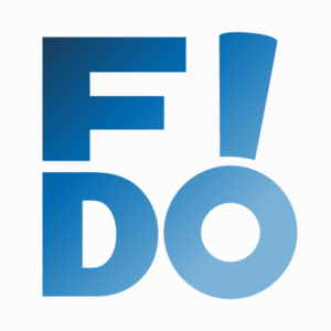
From the very beginning of the design of the logo, we noticed that the acronym FIDO consists of four letters, which allowed us to experiment between the syllables FI & DO. The next obvious step was to integrate these two syllables into a square frame, which would emphasize the geometry of the logo composition. At the same time, the word FIDO was perfectly clear and legible. The pairs of letters, however, have the following peculiarities:
- The first syllable (FI) consists of letters of rectangular shapes
- The second syllable (DO) consists of letters of curved / circular shapes
Placing the syllables in an absolutely square frame, created an imbalance. The empty white space between F-I and between D-O, was inhomogeneous. The solution was to redesign the F and I words so that they have longer and thicker curls. At the same time, I and O were rotated as an attempt to make the shape of the magnifying glass more visible and dynamic, maintaining, the readability of the acronym FIDO.
The font is a re-designable Franklin Gothic Heavy, which made the logo look clean, geometric, bold, and exudes seriousness, confidence and responsibility. Concepts, inextricably linked to the mission of the FIDO project.
The frame around the letters (FIDO) is so delicate so that the letters can “breathe”. The logo can be used also without the frame to provide more freedom in several applications (e.g. better application as a social media profile image).
The logo can be applied either in B&W or in color, depending on the medium. The main color is defined as a shade of blue (RGB # 3399FF), which mentally refers to the two largest social networks with a direct impact on misinformation. [Degrade is RGB #7BB3DB(8) – #183C5A]